Monday 21 May 2012

I put the black glasses on the table because they are her trademark. For the side plate I painted a plate flesh colour and but a scalpel over it. This was to symbolise that she's gone 'under the knife' many times.
For the glass I put the wine glass upside down on the table to indicate that it wasnt in use as she hasn't drank in years.
Anne Robinson is well known for presenting her show 'The Weakest Link'. I began to research more about the show and the different elements in it. i also looked into her personal life and discovered she is a recovering alcoholic. She has one daughter who she lost custody of only aged 2 because she was an unfit mother.
Robinson is well known for her blunt "you are the weakest link...goodbye". Her nickname is 'Queen of Mean'.
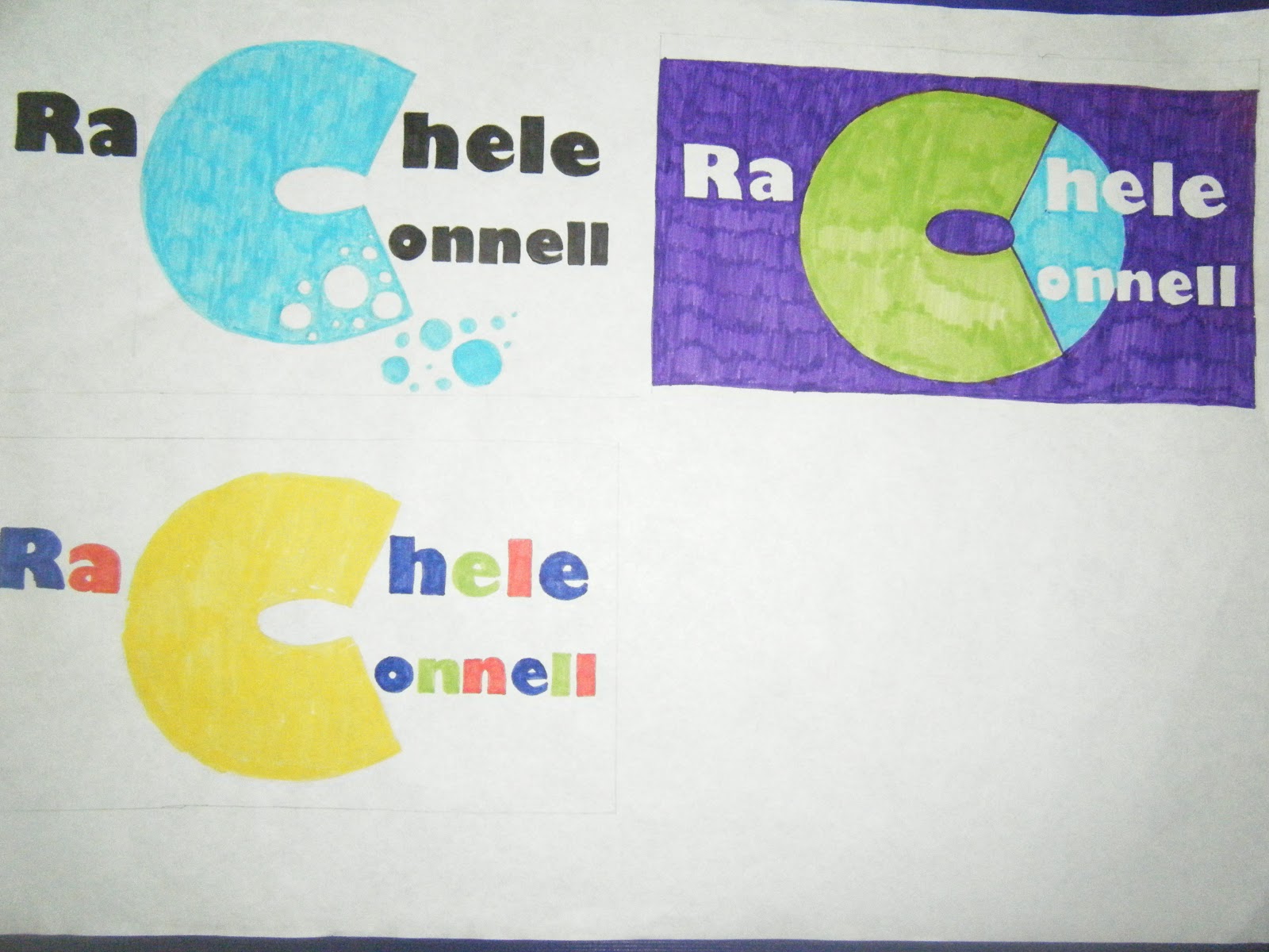
For my place setting i decided to make it more interactive like her show. For  the plate I choose to make an oval out of MDF and paint it blue just like the voting off boards which they use on the show.
I wanted to ask a question and then use the cutlery as the tools to answer. I decided to aske the question
 "what is the medical term used to describe what is commonly known as a facelift?
 A. Ostectomy 
B. Fistulotomy
 C.Rhytidectomy
I chose this question because anne robinson is well known for her many facelifts! 


On my cutlery i carver in the choices A, B and C and on the hanndles I carved in 'Goodbye' on the ones that were incorrect to hint at her "you are the weakest link goodbye" I put all this cutlery in the napkin so that you had to pull out the one you thought was correct.

Celebrity come dine with me

Our final project was very different to the others we had done over the weeks. For the project we all picked a celebrity's name out of a hat. The celebrity that i got is Anne Robinson. The idea of the project is to design a place setting for the person without using their name and trying to reflect their personality or line of work or what they are famous for.

Thursday 3 May 2012

I started to experiment wiht the letters and the idea that racheles bubbly when you get to know her so i was looking at the letter peeling back like peeling back her personality.

I looked at the peeling on different letters and with or without the box, i felt that the peeling n the C worked the best so i ran with that.

This was the final one in 5cm,10cm and 15cm in black and white and in colour.

 
The next thing was looking at different letterheads and seeing which one was most succesfull.


the one above was the one i choose. with the little fold of paper just like there is n the logo I uses this in the business card and compliment slip also to keep it consistent.

I tried out using Rachele's full name trying to use the C to show her bubbly/chatty side so i tried out a few on photo shop but they weren't very successful.

This was some more experimenting with the RC's


                             I liked the C tilted with the R because it was kind of fun and playful so i tried it out in bright vibrant colours.

After our crit my classmates and tutors gave me feedback so i developed this idea more after that to make the logo more my own.
This was when I was experimenting with the gills font.

I experimented with verdana font also but didn't think it really reflected racheles bubbly personality.


These are some of the mind maps of the information that rachele told me. She is a bubbly charachter when you get to know her so this was the subject I wanted to work with.
 I chose the gills sans ultra bold font to play around with and see what i could do with it. I looked at the different sizes and the upper and lower caseof Racheles innitials.


Monday 23 April 2012

after doing a personality test this is Racheles results!!

Your personality type: "Dreamy Idealist"

Quiet, reflective and idealistic. Interested in serving humanity. Well-developed value system, which they strive to live in accordance with. Extremely loyal. Adaptable and laid-back unless a strongly-held value is threatened. Usually talented writers. Mentally quick and able to see possibilities. Interested in understanding and helping people.

Sunday 22 April 2012

Personal Statement about Rachele!

My partner for our typographic ID project is Rachele Connell. From getting to know Rachele she's told me that  she's origonally from Scotland and now lives in Ennis. She's 19 and has two sisters. Her hobbies include playing the fiddle and she likes listening to music. Bombay bicycle club are one of her favourite bands. She likes sewing, knitting, gin and tonic and tea!! She has a bubbly personality and is really chatty!

Saturday 14 April 2012

After talking to my tutors they advised me to go with something a little less obvious than "save water".  So then I tried out "mind every drop" to get the message across.

To add some colour and emphasize the water I did the word 'drop' in red. My tutor then suggested to me that  I do the lock in red too to tie them together and with all the other stamps too. So from here I did the clothes peg, plaster and the zip all in red too.


I did some quick drawings of the stamps just to look at different layouts and where I would put the type in relation to the image.

I then went to photoshop and tried out a few differnt stamps still not sure which one I would choose.

These 2 became a definite but I made some further changes after this.


Wednesday 11 April 2012

For the crit on the Monday we had to have 2 sets of stamps with 2 different concepts at A5 size. My first concept was all about minding water so I combined the different things we use to hold, stop, save, or protect with the drop of water.

My second idea was more to do with water wastage and it's effect on humans. There was element to this set that I liked such as the fingerprint with the river and the drop and the slogan "waste water waste a life" but when I saw them all together they weren't very strong as a set of 4.

My tutors and classmates encourages me to with the drop idea. The close peg and the lock and chains were the most effective from the origonal set so I began to brainstorm some more with thumbnails for the 2 remaining stamps.


I then did a few quick thumbmails to try and decide what layout i was going to use for my stamp. Like where  I was going to position my text the image and the price etc.
These were my first thumbnail drawings just looking at the different things that we would associate with water and different things we associate with saving.

 These were more thumbnails where I started to look at different ideas. I was looking at the simple drop of water because it is clear and understandable bearing in mind the size the stamo was going to be.


Throughout my research I looked at the amount of water we waste in Ireland/Europe in comparison to the third world countries. The statistics were shocking. I learned that 4,000 children die everyday in Africa due to lack of fresh water. Reducing just one years worth of water wastage in Ireland will be enough to provide 1L of water per person everyday to the water-less population. This is when i started thinking of possible typography to put on a stamp with the phrase "waste water waste a life"


This is the mind map I started off with, looking at various ways of saving the environment.

This was some of my stamp research looking at the different layout, content, colour and type in different stamps.

I started looking at different posters promoting both clean water and saving water as I wasn't sure at this stage which one I would base my set of 4 stamps on.