Monday 23 April 2012

after doing a personality test this is Racheles results!!

Your personality type: "Dreamy Idealist"

Quiet, reflective and idealistic. Interested in serving humanity. Well-developed value system, which they strive to live in accordance with. Extremely loyal. Adaptable and laid-back unless a strongly-held value is threatened. Usually talented writers. Mentally quick and able to see possibilities. Interested in understanding and helping people.

Sunday 22 April 2012

Personal Statement about Rachele!

My partner for our typographic ID project is Rachele Connell. From getting to know Rachele she's told me that  she's origonally from Scotland and now lives in Ennis. She's 19 and has two sisters. Her hobbies include playing the fiddle and she likes listening to music. Bombay bicycle club are one of her favourite bands. She likes sewing, knitting, gin and tonic and tea!! She has a bubbly personality and is really chatty!

Saturday 14 April 2012

After talking to my tutors they advised me to go with something a little less obvious than "save water".  So then I tried out "mind every drop" to get the message across.

To add some colour and emphasize the water I did the word 'drop' in red. My tutor then suggested to me that  I do the lock in red too to tie them together and with all the other stamps too. So from here I did the clothes peg, plaster and the zip all in red too.


I did some quick drawings of the stamps just to look at different layouts and where I would put the type in relation to the image.

I then went to photoshop and tried out a few differnt stamps still not sure which one I would choose.

These 2 became a definite but I made some further changes after this.


Wednesday 11 April 2012

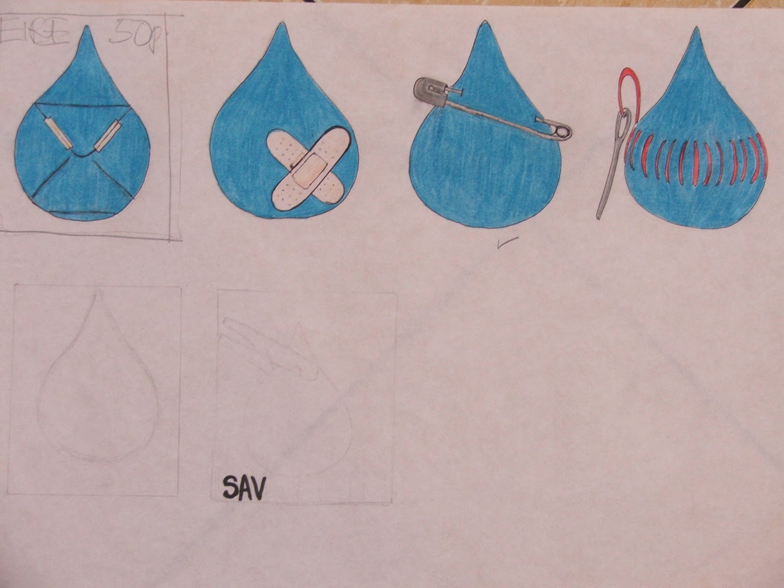
For the crit on the Monday we had to have 2 sets of stamps with 2 different concepts at A5 size. My first concept was all about minding water so I combined the different things we use to hold, stop, save, or protect with the drop of water.

My second idea was more to do with water wastage and it's effect on humans. There was element to this set that I liked such as the fingerprint with the river and the drop and the slogan "waste water waste a life" but when I saw them all together they weren't very strong as a set of 4.

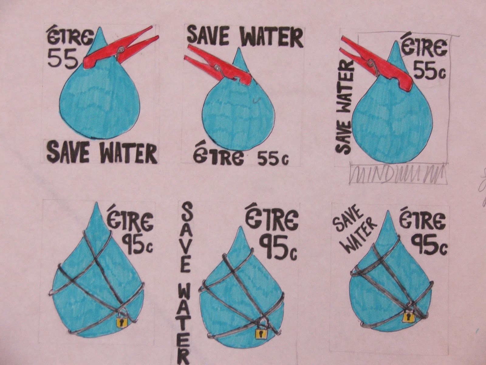
My tutors and classmates encourages me to with the drop idea. The close peg and the lock and chains were the most effective from the origonal set so I began to brainstorm some more with thumbnails for the 2 remaining stamps.


I then did a few quick thumbmails to try and decide what layout i was going to use for my stamp. Like where  I was going to position my text the image and the price etc.
These were my first thumbnail drawings just looking at the different things that we would associate with water and different things we associate with saving.

 These were more thumbnails where I started to look at different ideas. I was looking at the simple drop of water because it is clear and understandable bearing in mind the size the stamo was going to be.


Throughout my research I looked at the amount of water we waste in Ireland/Europe in comparison to the third world countries. The statistics were shocking. I learned that 4,000 children die everyday in Africa due to lack of fresh water. Reducing just one years worth of water wastage in Ireland will be enough to provide 1L of water per person everyday to the water-less population. This is when i started thinking of possible typography to put on a stamp with the phrase "waste water waste a life"


This is the mind map I started off with, looking at various ways of saving the environment.

This was some of my stamp research looking at the different layout, content, colour and type in different stamps.

I started looking at different posters promoting both clean water and saving water as I wasn't sure at this stage which one I would base my set of 4 stamps on.